QR Code Color Contrast: Why Lightness Matters, Not Hue
On this page
QR code color contrast comes down to one number per colour: how light it is. The open-source decoder jsQR and ZXing's Java library turn every pixel into a single grey value before they read anything, so hue drops out. Navy and deep purple read as dark; coral reads as mid-grey, and yellow and pastel pink as pale grey. You can calculate that lightness from a hex code with the W3C's relative luminance formula.
Facts checked on 5 November 2026.
Why a scanner sees lightness, not hue
The jsQR library starts by converting the image to greyscale, weighting each pixel's 0–255 channels as 0.2126 × red + 0.7152 × green + 0.0722 × blue. ZXing's Java library, when it receives RGB pixels, computes what its source code calls a "green-favouring average": (red + 2 × green + blue) ÷ 4. Both formulas give one brightness number per pixel. By our reading, two colours with the same brightness look identical to these decoders, whatever their hue.
The standard also reduces each module to one of two values. The reference decode procedure in the 2006 edition of ISO/IEC 18004 samples a 3 × 3 pixel area at each grid point and decides "dark or light" against a global threshold.
One exception matters for print. DENSO WAVE says in its FAQ that QR Code scanners use red light, so a red code on a white background cannot be read, and neither can a blue code on a green background. Its baseline advice is black on white. If your codes will be read by red-light scanners, hue matters too. We did not verify how phone camera apps turn colour into grey.
How to calculate relative luminance from a hex colour
The W3C's WCAG 2.2 definition normalises relative luminance to 0 for darkest black and 1 for lightest white. For a hex colour:
- Split the hex code into red, green and blue, and divide each by 255.
- Linearise each value: if it is 0.04045 or less, divide by 12.92; otherwise compute ((value + 0.055) ÷ 1.055) raised to the power 2.4.
- Add them up: L = 0.2126 × R + 0.7152 × G + 0.0722 × B.
- Compare two colours with the contrast ratio (L1 + 0.05) ÷ (L2 + 0.05), where L1 is the lighter colour. Ratios run from 1:1 to 21:1.
Worked example, navy #1d3557. The channels are 29, 53 and 87, or 0.1137, 0.2078 and 0.3412 after dividing by 255. All three are above 0.04045, so they linearise to 0.0123, 0.0356 and 0.0953. Weighted: 0.0026 + 0.0255 + 0.0069 = 0.035. Against white (L = 1), the ratio is 1.05 ÷ 0.085 = 12.4:1.
WCAG was written for text on web pages, not for QR codes. Its contrast success criterion asks for at least 4.5:1 for normal text and 3:1 for large text, says the computed value should not be rounded (4.499:1 misses 4.5:1), and explains that the calculation is built so that hue is not a key factor. No QR standard we read uses WCAG numbers; we borrow the formula because it turns any hex code into one published, repeatable lightness number. Rearranged, a colour needs L of about 0.183 or less to reach 4.5:1 against pure white (our arithmetic).
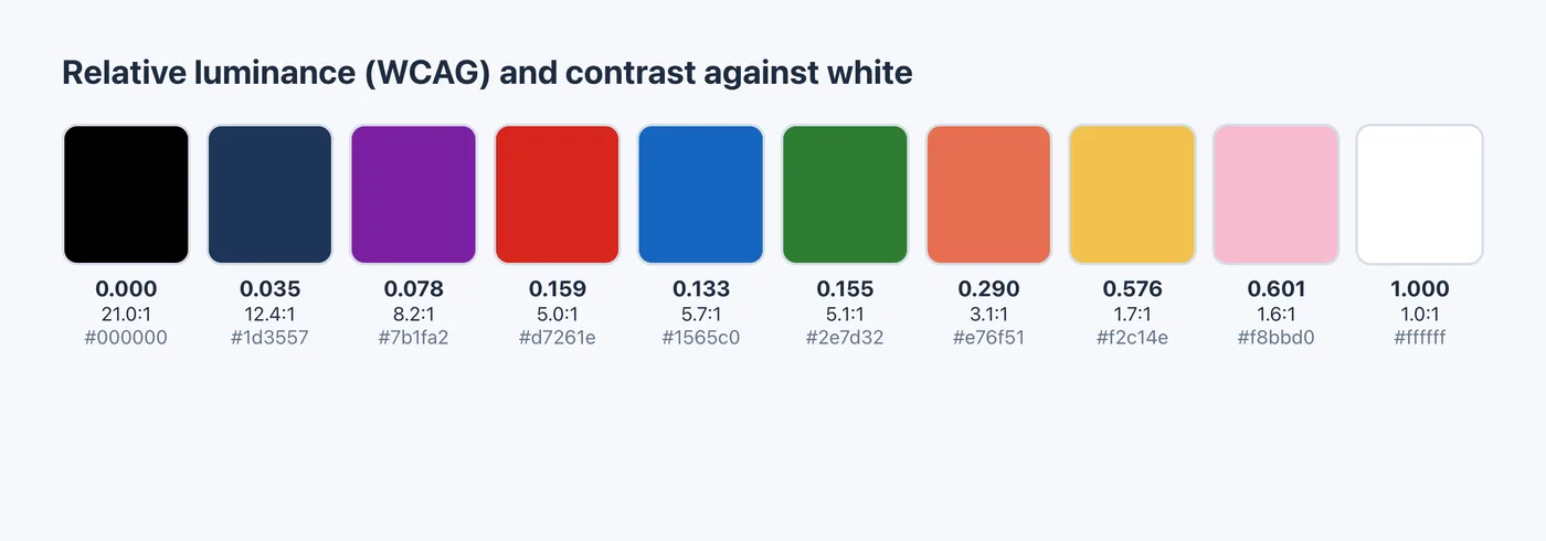
Diagram rendered for this article; values computed with the WCAG 2.2 formula.
QR code color contrast in our decoder tests
On 5 November 2026 we rendered one prototype round-dot code (error correction level H, a short link) in five colour schemes and decoded each with jsQR and ZXing at 400, 240 and 160 px wide. For ZXing we used zxing-wasm, a WebAssembly build of ZXing-C++, not the Java library quoted above; we did not check how it converts colour to grey.
| Colour scheme | Luminance or contrast | jsQR at 400 / 240 / 160 px | ZXing at 400 / 240 / 160 px |
|---|---|---|---|
| Navy #1d3557 on white (baseline) | L 0.035, 12.4:1 | failed / decoded / decoded | decoded at all three |
| Five dark colours, mixed per module | L 0.035–0.082 | failed / decoded / decoded | decoded at all three |
| Five mid-tone colours, mixed per module | L 0.27–0.58 | failed at all three | failed at all three |
| Pastel #c98aa0 on #fde8ef | 2.4:1 | failed at all three | decoded at all three |
| Light dots on navy (inverted) | Navy background, reversed | failed at all three without inversion; 2 of 3 with it | failed at all three without inversion; 3 of 3 with it |
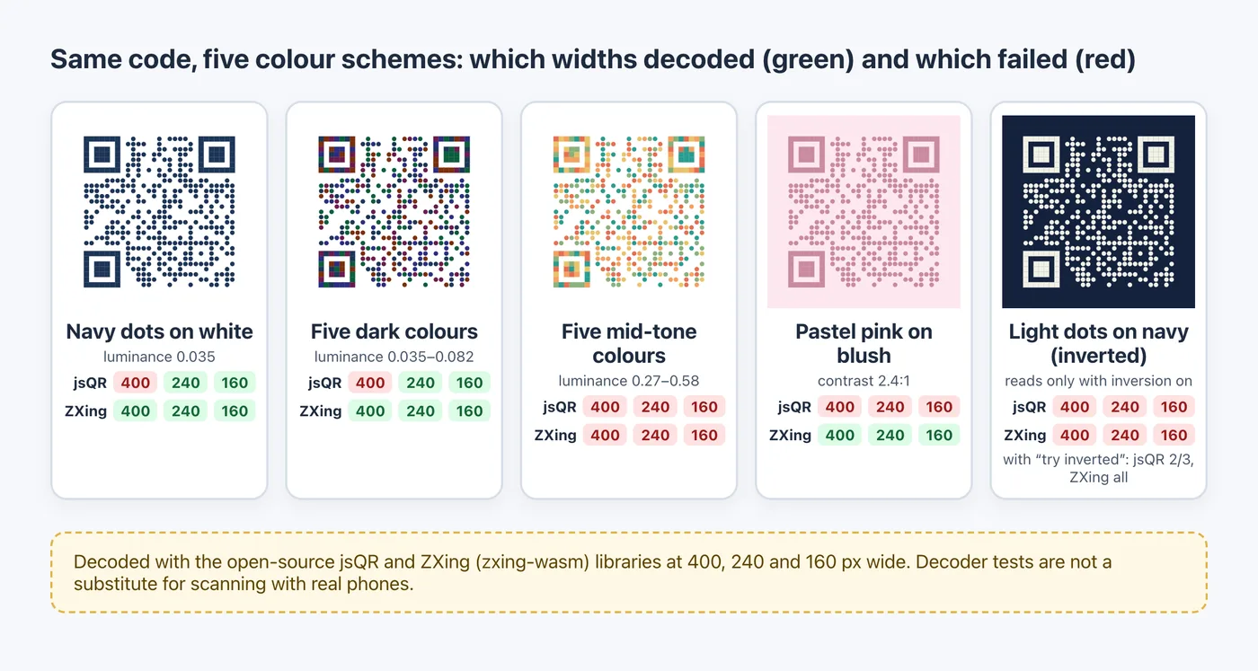
Diagram rendered for this article from our decoder test results.
Three readings stand out. The dark multi-colour code decoded exactly like the single-colour navy baseline; jsQR's miss at 400 px happened with navy too, so the colours were not the cause. The mid-tone palette looked just as colourful and failed everywhere; our reading is that its lighter modules, such as yellow at 1.7:1, sit too close to the white background. The pastel code split the two decoders, which is why one successful decode proves little. Decoder tests are not a substitute for scanning printed proofs with real phones, and no result here promises that any design will scan.
What a verifier grades: symbol contrast in ISO/IEC 15415
ISO/IEC 18004 says QR symbols shall be assessed for quality using the 2D print quality guidelines in ISO/IEC 15415. The 2006 edition also makes each scan's grade the lowest of its parameter grades, symbol contrast included, and the overall symbol grade the mean of several scans. We have not read ISO/IEC 15415 itself, so the details below come from verifier vendors (vendor documentation).
Cognex's DataMan 475V verifier manual defines symbol contrast as the difference in reflectivity between the brightest and darkest module, and grades it A at 70% or more, B from 55%, C from 40%, D from 20% and F below 20%. Axicon states that the 2024 version of ISO/IEC 15415 measures symbol contrast from the lightest and darkest 1% of pixels instead of the single lightest and darkest values.
Symbol contrast is a reflectance measurement of the printed code, not a number computed from a hex value, and we found no published conversion from a WCAG ratio to a symbol-contrast percentage. Use the formula to screen colours on screen; use a verifier or printed proofs to judge the print.
Light-on-dark codes need inversion support
The 2006 edition of ISO/IEC 18004 says symbols are intended to be read either dark on light or light on dark, and its decode procedure identifies reflectance polarity from the finder patterns. ISO published a fourth edition in August 2024, which we have not read.
Decoders handle inversion differently. ZXing's Java MultiFormatReader retries with an inverted image only when the caller sets the ALSO_INVERTED hint. jsQR tries both by default, at about a 50% performance cost, and its README says the default will probably change to not inverting. In our test, where we switched inversion off and on explicitly for both libraries, the inverted code failed every time it was off. If your layout is dark, put the code on a light panel; the troubleshooting checklist covers that fix.
Change the shape, not the lightness
To make a code look different without touching its lightness, change the dot shape. In the QR Maker AI editor, Style → Dot Style includes Weave and Vertical weave, Pro features as of November 2026 (see pricing). They join consecutive dark modules in a row or column into one rounded bar 0.76 modules wide that covers every module's centre. In our pre-release decoder tests, weave codes decoded with both libraries at every size tested.
Screenshot from a demo account with sample data.
Before you print a coloured code:
- Compute L for every dot colour, not an average of the palette.
- Keep each dot colour well below the background; the dark set that decoded in our test ranged from roughly 8:1 to 12.4:1 against white.
- Keep the finder patterns dark and the background light.
- Check the exported file with the free QR code checker, which computes a WCAG ratio between the average dark module and the light modules, and flags anything below 4.5:1, then scan a printed proof with several phones.
For pictures under the dots, see how artistic QR codes still scan; for colour ideas by setting, see QR code design ideas.
FAQ
Can a QR code be any color?
The dots can be any colour that is much darker than the background, because the open-source decoder code we read reduces colour to brightness. DENSO WAVE's FAQ adds that red-light scanners cannot read a red code on white, so test colours on the scanners your audience uses.
What contrast ratio should a QR code have?
No QR standard we read sets a WCAG ratio. Verifiers grade symbol contrast from measured reflectance, with A at 70% or more in Cognex's manual. As a screening rule, the dark colours that decoded in our tests had roughly 8:1 or more against white.
Why does my yellow or gold QR code not scan?
Yellow is light. #f2c14e has a relative luminance of 0.576 and only 1.7:1 contrast against white, so a decoder sees pale grey dots on white. Use a dark colour for the dots and put the yellow in a frame.
Do inverted QR codes work?
The standard allows light-on-dark codes, but the decoder has to try an inverted image. In our test, both decoders failed without inversion; we did not test phone camera apps, so a dark-on-light code is the safer choice.
Sources
- W3C — Web Content Accessibility Guidelines (WCAG) 2.2: relative luminance and contrast ratio definitions. W3C Recommendation, published 12 December 2024. Accessed 5 November 2026.
- jsQR project — src/binarizer/index.ts. Undated source file. Accessed 5 November 2026.
- ZXing project — RGBLuminanceSource.java. Undated source file. Accessed 5 November 2026.
- ISO/IEC — ISO/IEC 18004:2006, QR Code 2005 bar code symbology specification. Second edition, published 1 September 2006 (copy hosted by Public.Resource.Org). Accessed 5 November 2026.
- DENSO WAVE — FAQ. QRcode.com, undated. Accessed 5 November 2026.
- W3C WAI — Understanding Success Criterion 1.4.3: Contrast (Minimum). Updated 6 September 2026. Accessed 5 November 2026.
- zxing-wasm project — README. Undated. Accessed 5 November 2026.
- Cognex — ISO/IEC 15415 Grading Parameters, DataMan 475V Verifier Reference Manual. Dated 13 August 2020. Accessed 5 November 2026. (vendor data)
- Axicon — ISO/IEC standard for 2D barcodes. Undated. Accessed 5 November 2026. (vendor data)
- ISO — ISO/IEC 18004:2024 standard page. Fourth edition, published August 2024. Accessed 5 November 2026.
- ZXing project — MultiFormatReader.java. Undated source file. Accessed 5 November 2026.
- ZXing project — DecodeHintType.java. Undated source file. Accessed 5 November 2026.
- jsQR project — README. Undated. Accessed 5 November 2026.